Wednesday 30 April 2014

Speaking From Experience - Final Design

Below are photographs from my final outcome for the Speaking From Experience brief. I feel that the re-designed booklet has a much more light-hearted layout, looks a lot more fun, and is a lot less text heavy.

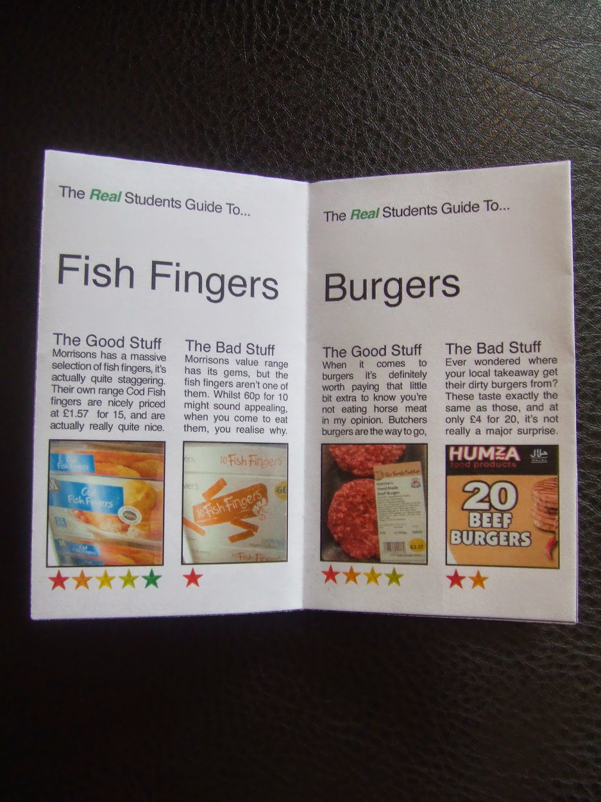
There are two reasons behind me only describing one food product on each page instead of two. The first was that if you’re advising someone on what they should buy, then essentially you’re suggesting that they don’t buy anything else, so there’s really no need to single out one particular product not to buy, and this will avoid me having to use things with negatie connotations in my design. The second was that the advice from the crit was that the booklet was far too text heavy, which I agree with in retrospect.


Size, Format and Layout
I was going to keep the fundamental content the same, and had no particular reason to change the format of the book, but because I was reducing the amount of text on the page, I increased the amount of space taken up by the title to reduce the amount of whitespace. I stuck to the two columns but never used them for full on blocks of text side by side, and so the layout does look a lot less intense than it did previously. 

Colour
Now that all the content on the page is positive, I didn’t have to the problems of mixing connotations, and so I stuck to the Waitrose green as whilst green has positive connotations, it still has the ironic factor to it because of the huge difference between the food Waitrose sell and the food in the booklet.

Fonts and Text
The first thing I did was change the title font. I used a woodblock style slab serif font as I feel that it has quite jolly and happy connotations, and my research into student cookbooks and supermarkets suggest that wider fonts tent to be used in more carefree branding for simpler products and companies. I ended up using a font called Siserrif as it fits the above requirements, although it does look very similar to the typeface Morisons use in their logo. The feedback was that Helvetica was too generic to use in this sort of book, and that I should use something a bit different. I maintain that I needed to use a sans serif font for legibiilty on a small scale. I experimented with a couple of other fonts before deciding Gotham Book was appropriate as the very rounded shapes of the circles have a carefree attitude about them. I changed the leading to -30 though, as I felt the spacing between the letters was far too large.

Images
It was suggested in the interim crit that I replaced the photographs with drawings. I disagreed because I felt that photographs were more functional and useful. But the re-design of my booklet gave me space to include some vector images, and I'm glad I put these in, because I think they make the tone of the booklet a lot less serious, which is something that the original booklet was lacking, but using them with the photographs allowed me to maintain the usefulness of the photos.


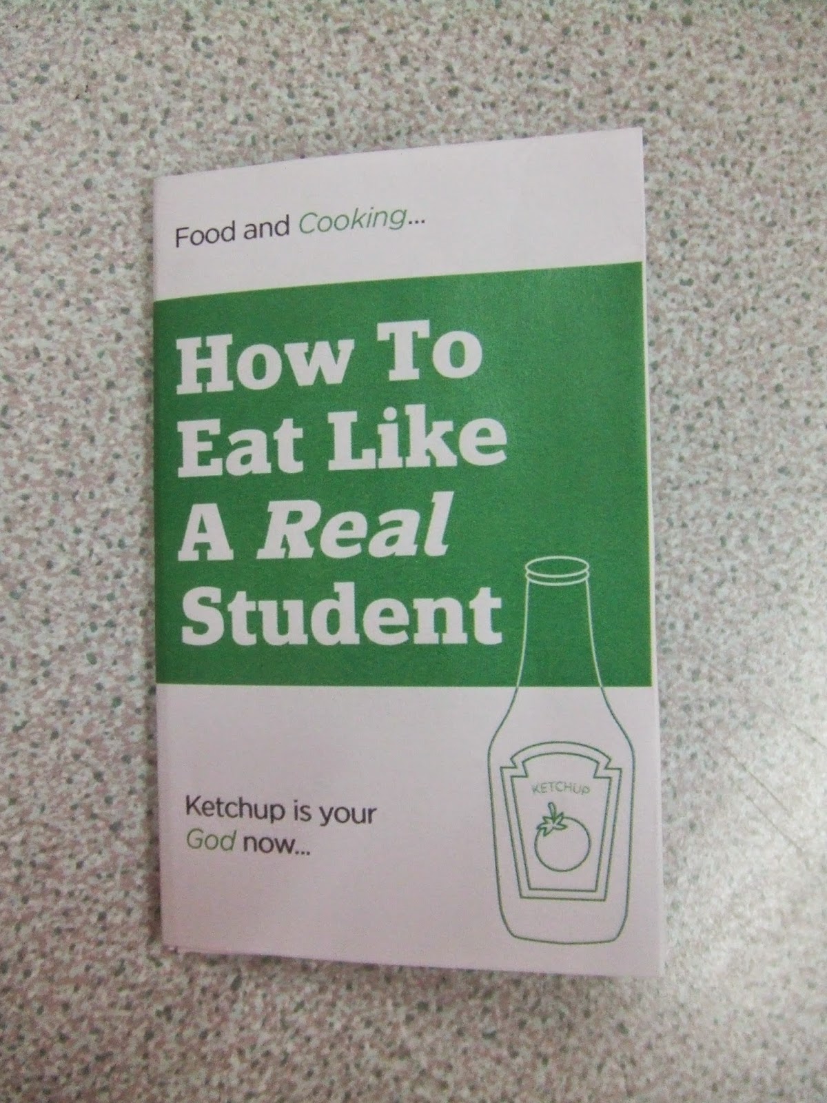
I felt that the booklet was a little too flimsy, and so tried printing on thicker stock. I chose stock that was a creamy colour as well to experiment with how it would look on an off white background. The photo above shows a close up of the front cover of the booklet, and shows the cracks in the ink over the spine in the book, and this meant that using thicker stock was out of the question. I also felt that the off white had a horrible contrast with the green, and so decided to stick with the white background.


After doing a final check of my outcome, I noticed there was a problem on the chicken page, where I'd messed up the process of preparing the InDesign file for print. This caused me a few problems as I had to go through the process again, which wasted about an hour.

Monday 28 April 2014

Speaking From Experience - Final Crit

In todays final crit, I presented a test print of my booklet on how to cook student food without putting in much effort.


Initially, the reception was good, people found it quite funny and said the content was good at the same time. However, a few issues were raised.


  • The front and back pages were too text heavy.
  • The columns were too narrow to use fully justified text.
  • A two column layout is too serious for the tone of the text.
  • It wasn't clear what the stars represent.
  • A serif font would be more appropriate because serifs are less boring and therefore more fun.
Fortunately the most time consuming thing about what I'd produced was the content, and so re-arranging the layout shouldn't be too much of a time-consuming job.

My crit group also felt that the humour could be taken a lot lot further, which is something I was pleased about.

Thursday 24 April 2014

Design Improvements/Changes - Speaking From Experience

Areas to Improve 


Looking back on what I produced yesterday, as well as looking at the areas highlighted in the feedback from my coursemates, I also noticed two other things I could/should change today, highlighted in the red circles. 

The first thing is that it looked like I was only comparing food that was priced the same, whilst this is true in this case, it isn't always going to be the case, and buy putting the price in the sub-heading it over-emphasizes price, when what I'm looking at is general value. I'm going to change this simply by including the price in the body text rather than the sub-heading.

The second was that whilst, a 1 star rating is really bad, I still had the star in green, a colour which has positive connotations. I'm going to change this by having each potential stat be a different colour. The left star will be red, the right will be green, and the three in between will make a gradient so that the better food automatically has positive connotations compared to the worse food.

The below shot shows the result of the changes I made to the sausages page.


Following some of the feedback I received, I experimented with different fonts under the good and bad sections, but I wasn't happy with the results. I started by looking at typefaces that had both serif and sans-serif versions of them, and picked, in my opinion, the most readable and legible of them, ITC Stones. I did this because by using the same typeface it doesn't un-necessarily over-complicate the hierarchy. I used the sans serif for the text about the "good" food and the serif for the bad food, as this makes the bad food stand out from the rest of the hierarchy more, and in doing so it isolates it a bit, which has negative connotations. I also experimented with using Futura, and alternate sans serif typeface alongside Helvetica to try and achieve the same negative connotations, but I didn't feel like they looked nice next to each other, and the Futura looked out of place. Although it's a good concept to use, compared to sticking with just one font, mixing the fonts didn't look very nice aesthetically, and so I've decided to just stick with Helvetica throughout the booklet.


After completing all the individual pages, I then worked on the front and back covers, which are shown below. I stuck to the same layout for consistency, but went with more text-based content to be more informative. I'm aware that the back page reads as "The real students guide to top tips", which clearly doesn't make sense, but in the context of the booklet, as this is the last page this doesn't really matter as the top line is really only needed as an introduction to the booklet.


Wednesday 23 April 2014

Initial Design - Speaking From Experience

Initial Design


Size, Format and Layout
I initially looked at using a B size for my booklet, but the idea of the booklet was that it was pocket size, so you can take it with you when doing the food shop, and the B sizes didn't really lend themselves to the sizes of the back pockets, so I made a custom size of 75mm by 120mm as that keeps the booklet small enough to fit in a pocket, large enough to have space for information, and being the golden ratio. I decided I'd produce it as a hot dog fold booklet, due to the link with food. This means that I'd have to do an 8 page booklet, which seems appropriate, a front cover, a back cover, then either 3 spreads or 6 individual leaves. I stuck to the golden ratio when creating a grid, and used the heights of the Fibonacci squares to create by guides as shown below. I slightly altered the grid I set up for myself because the 5 stars didn't look very good squeezed into the bottom section of the grid, so to get round this I just combined the bottom two rows of the grid, and I don't really think the design suffers at all for this. 


Fonts and Text
Due to my booklet being small, it was important that the text used was both very legible and very readable, so I picked Helvetica as the typeface I would use as it's very simple. I built the hierarchy by starting with the title, which is 32pt, as that is the biggest common size that didn't make the title "Sausages" go right across the page. I didn't want that to happen because then that would be the only page where there wouldn't be an extra bit of whitespace extra to the margin to the right of the title. I then experimented with body copy, and found that 7 lines of text was generally enough to talk about the food, and so fitting that and a sub-heading in the middle section of the layout meant than 8pt body text with 12pt sub-heading text fitted perfectly. It seemed appropriate to use the same size type for the text at the top of the page so as to not over-complicate the hierarchy, I did however want to exaggerate the word "Real", as that is the point of this booklet. I did this by making it bold to emphasise it, made it italic to suggest irony, and backed the irony up by using the colour drop tool to make it the same colour as the green as Waitrose use, the result of this gave me exactly what I was looking for.

Feedback
I sent the people in my interim crit a message asking them for feedback on what I'd produced in terms of how suitable it was for the outlines I'd proposed during the crit, the feedback was this:


  • I read it and was like "the good, the bad and the ugly."
  • I think you need a different type face something that communicates your theme better. I do really like the layout though.
  • It's a good idea but the layouts just a bit boring. I think the logo thing at the top is sound though.
  • Maybe you could have illustrations to go along with the type and just use small images of the actual products.
  • Maybe two different type faces, one for the good side one for the bad side?

My response to this was that the first bid of feedback was something I needed to do something about, as it's a completely irrelevant connotation. The second bit of feedback seems a bit vague to me, I'm not sure if the person who said it just said it trying to be helpful, or had genuinely thought it through, because I've no idea what it means, and it hasn't really pointed me in any direction, so I chose to ignore this. The third bit of feedback is difficult to know what to take from, as I appreciate that the layout is a bit boring, but it needs to be to aid readability on such a small scale, and when I asked for feedback I didn't explain that it was going to printed out small, and so it's difficult to know if this is really an issue. It was pleasing to hear that I got the exaggeration of "Real" right though. This sort of carries into the 4th bit of feedback, as it's clear from the way it was worded that they didn't know it was to be printed out small. I also disagree with the use of illustrations, as photographs would be the most useful thing to help people identify things, hence why they're used in catalogues. The final piece of advice was a very interesting idea, and wasn't something that I'd thought about, and is definitely something I'll look at.

Tuesday 22 April 2014

Speaking From Experience - Interim Crit / Project Proposal

Drinking
Being away from home and having your own place to live obviously leads to a massive change in lifestyle. Living with people with your own age tends to lead to lots of extra going out and drinking and doing stupid stuff. Doing something about this is something that I could speak from experience about, but it’s not really going to help anyone because they’re still going to go out and do stupid stuff.

Eating
I was told that uni is where people learn to cook and survive on their own. In my experience I’ve not improved at all due to not needing to bother, as toast, oven food, bacon and pancakes are in fact food, and so I have not and will not starve. My flatmates do make a lot more effort than me with food, and I don’t understand why, as I would suggest it’s just a waste of time and money.

Extra Work
There’s a massive change in the amount of work between higher education and further education, and dealing with that takes time to adjust to, but by the time I realised and dealt with this I was over half way through the second term, and it was already too late to get the most out of the first year. I feel like this would potentially help people, but I can’t see any way that I would enjoy doing a project on this. Even if I did, it’s not the sort of thing that first years are interested in listening too.

Eating
Based on my experience of cooking at uni, I created a survey to ask if other people felt the same way as me so I could identify my target audience, if it even existed. I’m targeting people who answered either No or Not Bothered to the third question, and Price or Easy to the fourth. They’re highlighted below. Before refers to how good they thought they were at cooking out of 10 before uni, and now refers to how good they think they are out of 10 now.


Target Audience Analysis
10 out of the 22 students (45%) who answered my questions are my audience. 

56% of male students who answered my questions are my audience.

33% of female students who answered my questions are my audience.

The 10 students who answered my questions thought their cooking had improved buy 1.2 out of 10 on average since they’d started university, whereas those who aren’t my target audience reckoned they’d improved by an average of 2.6/10.

Only 25% of students who answered my questions and aren’t my target audience wish they’d been more experimental with food and feel quality is the most important thing when buying food, which means that 75% people that aren’t my target audience might still be interested in what I produce.

Brief
I want to create a short guide to oven food, as that is what optimises cheap and easy to cook student food. I want to make it with a slightly sarcastic tone because it goes hand in hand with the fact that the people who’ll be making use of of the guide don’t really have any intentions of doing any other sort of food, so they may as well make this food sound like it’s from M&S.

What It Will Include
  • Which supermarkets are the best to go to.
  • Which individual brands are best to get.
  • What’s the best way to cook everything.
  • How to pad things out to make a fulfilling meal.
  • General financial advice about food.


What I Hope To Achieve
  • Create something that is genuinely informative and somewhat useful to people who intend not to put a serious effort into cooking.
  • Create something that is obviously in a somewhat sarcastic voice which will appeal to the sort of audience.
  • Have a laugh doing it.


What To Research
  • Price comparisons between supermarkets
  • Comparison websites (hotels, insurance, etc)
  • Food packaging and advertising design
  • Student guides
  • Cook books